About
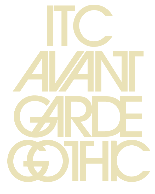
Avant Garde Gothic has been around since the late 19605. It was first used as the logo for a new Ginzburg. Herb Lubalin, the art director for thepublication, showed several sketches for the logo to Ginzburg but none captured the concept of the magazine-to be called AVANT GARDE.
Finally, for his historic solution, Lubalin adapted gothic caps and changed the angles of the A and V so they fit together like a wedge of pie. He angularized the second A so that its right stem was parallel with the left of the N and halved the T so that half of it was part of the N. The perfectly round G carved into the angular A in GARDE and the D/E combination was made into a ligature. Both words were tightly letterspaced to be perfectly stacked, and thus could fit as a block anywhere on the cover.
Lubalin turned his rough sketch over to type designer Tom Carnase, his partner at Lubalin Smith Carnase, who rendered the final form. Since Lubalin wanted all department heads for the magazine to be consistent with the logo, Carnase designed additional characters and created more ligatures. After making a handful of these headlines, he realized there were almost enough characters to complete an entire alphabet-and
Avant Garde Gothic was born.
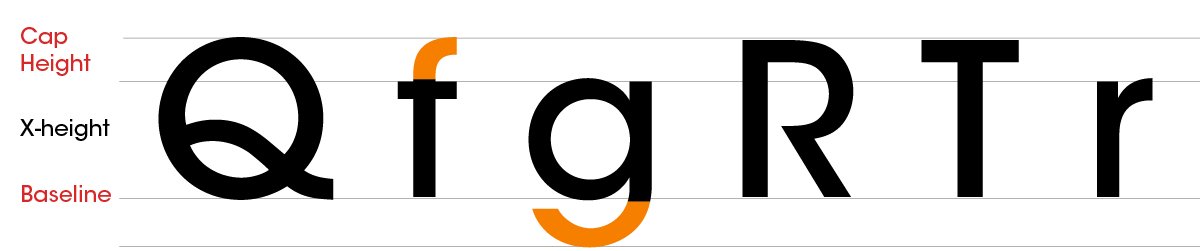
Type Anatomy
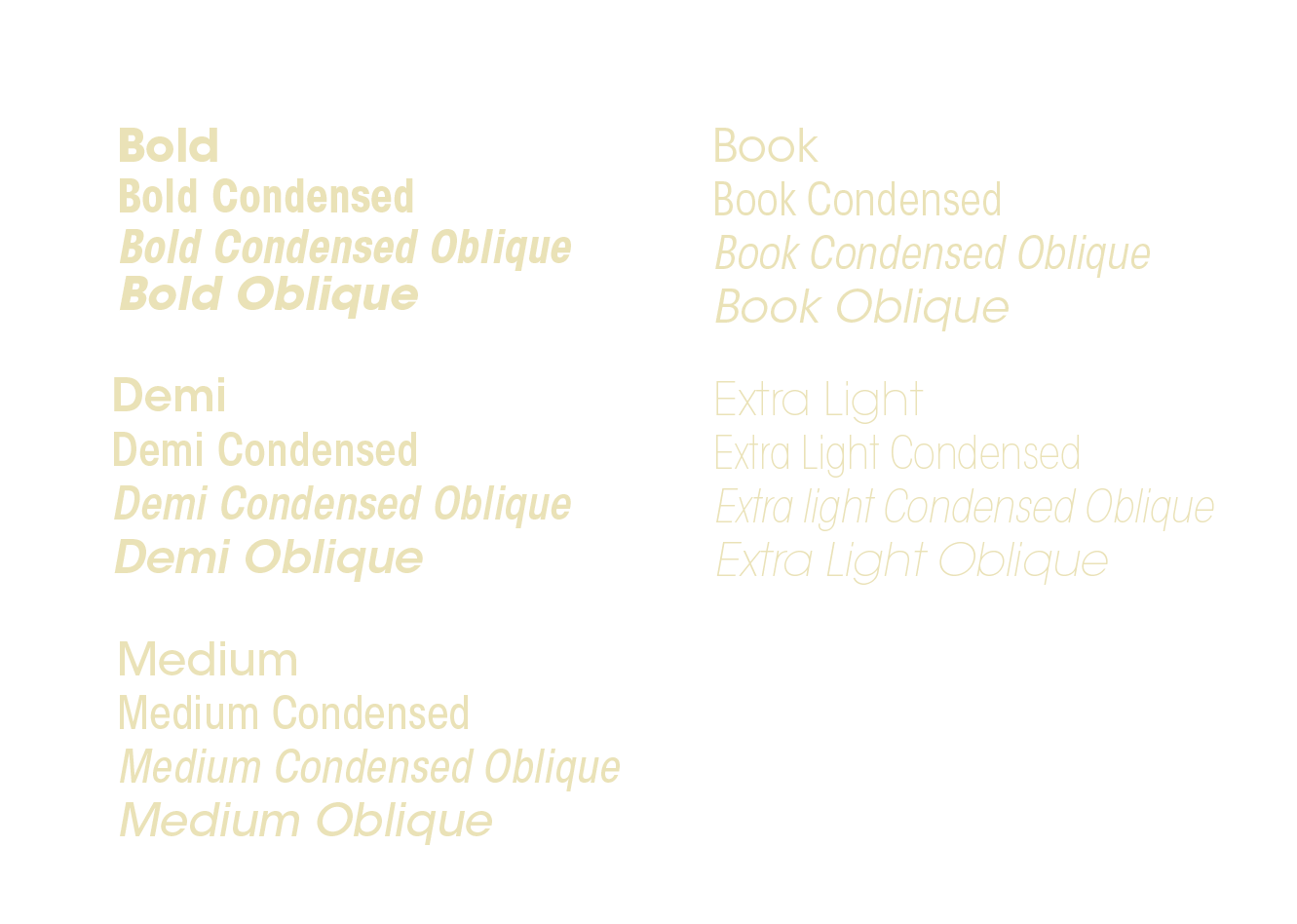
Weight
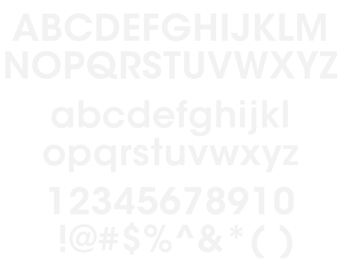
Alternatives are
undeniably beautiful.
The glyphs created by
alternating and
intersecting parts of
letters are elegant and
visually interesting.